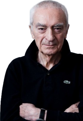
Arguably the most commonly recurring question among the design community, often debated and ever changing in conclusion. However the principles of design practiced and preached by Italian born designer Massimo Vignelli embodies what many today consider great design. Massimo Vignelli has had a profound influence on modern design, his creations surround us constantly, his legacy lives on through current and future designers who emulate his principles. Even those ignorant of design, who may never have heard of Vignelli will know his work and regularly come in contact with it. But what is it that makes the design work of Massimo Vignelli so great? To answer these questions we must understand the man and his work.

The Beginnings
Born in Milan Italy, Massimo grew up surrounded by beautiful art and design, at an early age he developed an avid interest in architecture and immersed himself in the world of aesthetic architectural structures. He went on to study architecture at the Polytechnic University of Milan, later furthering his studies at the Higher Institute of Architecture Venice. However his passion for good design was not limited to architecture.
“An architect should be able to design anything from a spoon to a city”
Inspired by the words of the Austrian architect, Vignelli developed his own ethos “If you can design one thing you can design everything.” Early in his career Vignelli shared an apartment with Swiss graphic designer Max Huber. It was during this time that Massimo developed a keen interest for graphic design. Vignelli was very clearly influenced by the clean, minimalistic elegance of the modernist and swiss style graphic design. The principles and characteristics of which are evident throughout all of his design work, from graphic design and architecture to product design.
The Journey
Massimo Along with his wife Lella first arrived in the USA in 1957 on a fellowship however he soon returned to Italy in 1960 where he opened an office of design and architecture, and also taught graphic design. It was not until 1966 that the Vignellis would return to the US, where Massimo helped to found Unimark international, through which he was able to work on many high profile design projects. It was through his work at Unimark that Vignelli was able to gain considerable fame and put a very prominent mark on modern design. However the founders of Unimark parted ways and Vignelli resigned in 1971 as the company’s priorities became increasingly more displaced from a design orientated ethos to marketing based one.
After leaving Unimark Massimo founded Vignelli associates where he continued to make his mark on modern design, pursuing his passion, crossing the non existent barriers between design principles. One of few designers to leave a permanent mark on the world, Vignelli is remembered as a master and tutor of great design. Having taught his principles in many institutions, reaching many designers and having published “The Vignelli Canon” his legacy continues in past, present and future design. Self proclaimed as the pioneer of the Helvetica typeface’s use in America, he is considered to have been an major contributor in the expansion of modernist design and its success in America.
Work
Although Massimo took inspiration from the Swiss style he did not rely on it. His style became distinguishable and unique, one which many look to for example of great design. There are a few constants of Massimo Vignelli’s work that makes it so distinguishable and great.
The Grid
One of these constants was his consistent use of a grid system as a structural guide to his design. This allowed him to the create visually clean, minimalistic and legible design productions he was famous for. While Vignelli used the grid as a structural guide he did not allow it to become a restraint. He said he learned “not to be always faithful to the grid, but to know when to stay in and when to stay out” in this innovative way he made his own mark on modernist design.
“He brought the grid to this country, but he relieved the extreme rigor of the Swiss”
Typography
Accredited as the typeface that conquered the world, it is inarguable that Helvetica owes much of it’s fame to Massimo Vignelli. Massimo considered the over production and manipulation of typefaces following the introduction of the computer a nuisance. His structural use of typography was another constant characteristic of his work. Massimo adhered to a strict typographical regimen of typefaces that he considered worthy of using. Of the serif family Vignelli favoured Garamond, Bodoni and Times Roman and of the sans-serif family Akzidenz Grotesk, Helvetica, Arial, Univers and Futura. It was with this typographical toolkit that Vignelli created most of his work, however his clear favourite was Helvetica and with this typeface he all but affirmed the way in which many of us we receive information today.
American Airlines

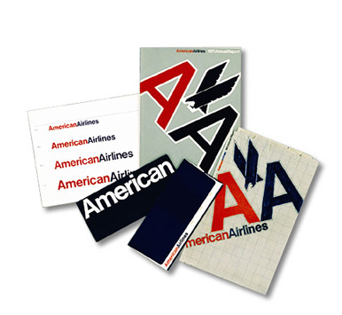
During his time at Unimark International Massimo Vignelli helped develop the branding for American Airlines, this project became one of the most iconic examples of Vignelli’s work and great design; and it was with this project that Vignelli said he helped make America a Helvetica country. With this simplistic plain typeface in red and blue Vignelli embodied the “no-gimmicks attitude of the company in the colours of it’s home nation”. His branding design was the longest used by American Airlines having only been revisited and changed very recently.
New York Subway Map

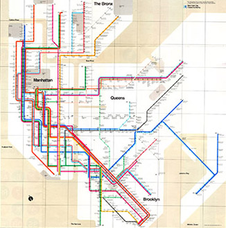
Massimo Vignelli’s interpretation of the New York City subway transit map is probably the most iconic and notorious example of his work. He “reimagined the MTA New York City Transit subway system as a neat grid of colored lines surrounded by a beige ocean.” - Metro Transit Authority. Vignelli’s design of the New York City Subway map was met with both praise and criticism, some saw his abstract, simplistic representation as an aesthetically pleasing improvement on the cluttered and complicated previous design. However many New York commuters found the new design confusing and impractical, as they struggled to comprehend the lack of geographical precision.
Conclusion
It was not by luck that Vignelli had the opportunity to work on such notable design projects, his system for design and the principles he lived and worked allowed him to create very aesthetically pleasing, elegant and functional designs. “We are systematic, logical and objective, not trendy. Trends kill the soul of design. Modernism took out all the junk, and postmodernism put it all back in.” To Massimo the function of design was simple, to make things better. To do this he believed things should serve a function in the most minimalistic way possible. He insisted that the enemy of great design was vulgarity, as opposed to intellectually elegant design. The addition of unnecessary features which served no function created vulgar designs. He sought to “sift” out what was bad about a design and leave the minimal essentials, by doing so he believed he could create intellectually compelling and elegant designs and what he considered great design.
When Michael Bierut of pentagram design spoke of his experience during his time as an intern at Vignelli associates he said “it seemed to me that the whole city of New York was a permanent Vignelli exhibition. To get to the office, I rode in a subway with Vignelli-designed signage, shared the sidewalk with people holding Vignelli-designed Bloomingdales shopping bags, walked by St. Peter’s Church with its Vignelli-designed pipe organ visible through the window. At Vignelli Associates, at 23 years old, I felt I was at the center of the universe.” Even today we live in a world in which we are surrounded every day by Vignelli designs, or designs that have been someway influenced by the man and the principles that he preached. So what made Vignelli’s design so great? What makes great design? Massimo Vignelli insisted that design should be “visually powerful and intellectually elegant” This stands true to his design, Vignelli’s creations are instantly recognizable, distinguishable, yet they remain without a time constraint.
Even under scrutiny it is difficult to deduce which time period many of Vignelli’s designs came from. In addition to his work for American Airlines and the New York Metro Transit Authorities, Vignelli worked on many other high profile design projects including the branding of various household brand names such as IBM, Bloomingdales, JCPenney, Ford, Knoll and many more. Almost all of the brands for which Massimo Vignelli designed the branding share one thing in common. Their branding design remains relevant and consistent today. As Vignelli often preached, “If you do it right, it will last forever.” Which goes some way to explain what made Massimo Vignelli’s design so great, and what many consider makes great design today; Timelessness. While many designs fade with the passing of fashion trends, Massimo’s design and work remains relevant and will live on. It is this that many consider to be a primary feature of great design, and for Massimo Vignelli great design was...
“visually powerful, intellectually elegant, and above all timeless.”
